
Proven Leadership Success
Global Design Leadership at Scale
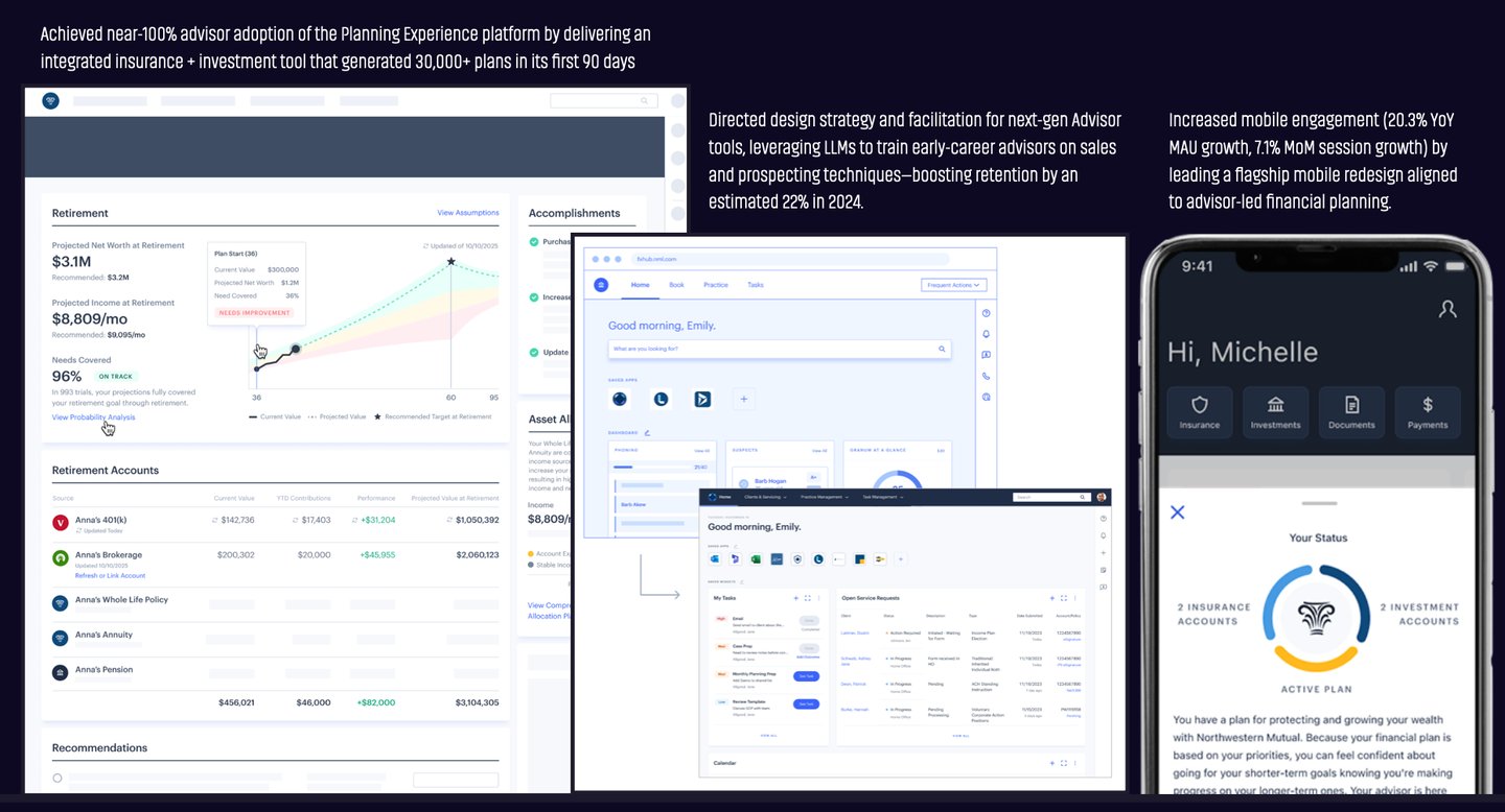
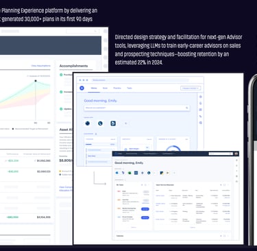
Drive Better Design Delivery
AI-Driven Experience Innovation
I define AI-first, agentic product visions that clarify when and how systems should act on users’ behalf.
My work translates emerging AI capabilities into clear design principles, patterns, and product narratives—aligning senior leaders and teams around responsible, high-value AI experiences that are ready to ship.
I improve design effectiveness by reshaping design operations, team models, and quality expectations.
I set and reinforce higher UX standards—modern navigation, introducing dark mode to enable deep work, and data-dense interfaces—so teams consistently deliver clear, efficient, high-quality product experiences customers love and value.
I lead global design organizations, integrating design, research, accessibility, and systems into enterprise strategy to deliver measurable product impact.
I grow and promote top talent, creating clear paths for advancement and cultures that make design teams a destination for exceptional work.


Design Impact by the Numbers
Management Scope
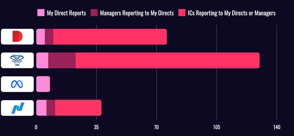
Over the past five years at Northwestern Mutual and Diligent, I’ve led large, multi-layered design organizations, including teams of Directors who themselves lead managers and ICs.
While at Meta, I led smaller, high-impact teams—giving me a well-rounded perspective on team dynamics at every scale. This range of experience enables me to drive clarity, cohesion, and performance across complex org structures.
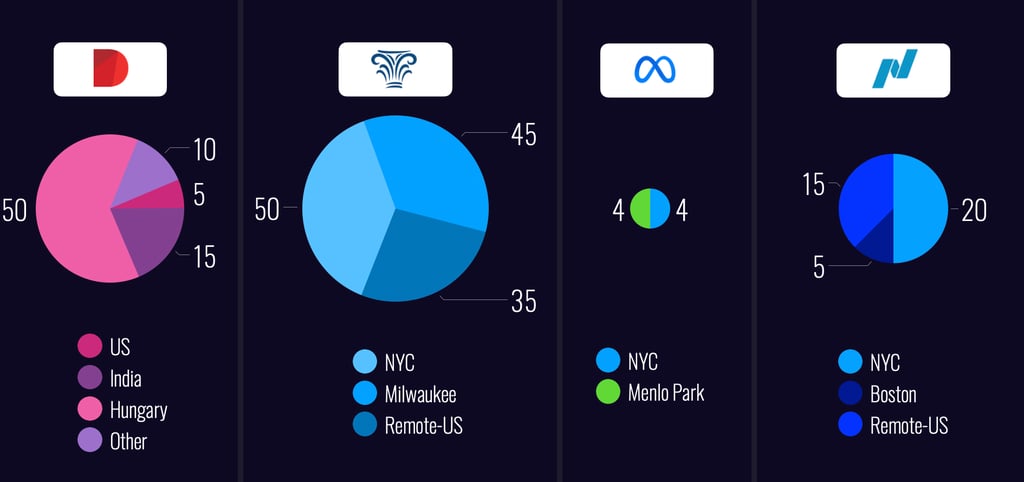
Leading Global & Local Design Teams
My teams have spanned continents and cultures—from Budapest to Baltimore and Milwaukee to Menlo Park. These charts illustrate how I’ve led distributed teams across companies of varying scale and structure. Whether building co-located hubs or remote-first orgs, I’ve developed systems to keep teams aligned, collaborative, and high-performing—regardless of geography.
I live near the beach in New Jersey and have spent years working in remote and hybrid teams. With easy ferry access to Manhattan, Brooklyn, and Jersey City, I stay well-connected to key hubs while leading globally. I thrive at a NYC desk, surrounded by designers, product collaborators, and senior leaders driving impact together.
Designing Influence
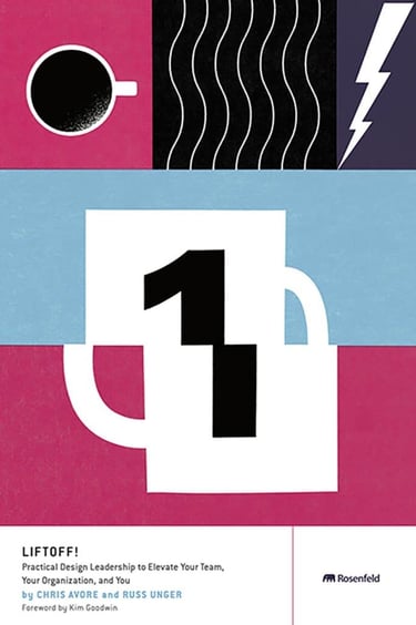

Author of Liftoff! – A Playbook for Design Leaders
I'm the co-author of Liftoff!, a practical guide for new and emerging design leaders. Published by Rosenfeld Media, the book distills hard-earned lessons from building and scaling design teams at high-growth companies. It’s used in design orgs around the world to help managers gain confidence, navigate ambiguity, and lead with impact.
Learn more about Liftoff! and why it’s become a go-to resource for emerging and established design leaders, or check it out on RosenfeldMedia.com.
I share what I’ve learned to help others lead with more clarity, confidence, and impact — whether through writing, speaking, or mentoring. From co-authoring a go-to guide for design leaders to speaking on global stages, I aim to make leadership more accessible and actionable.
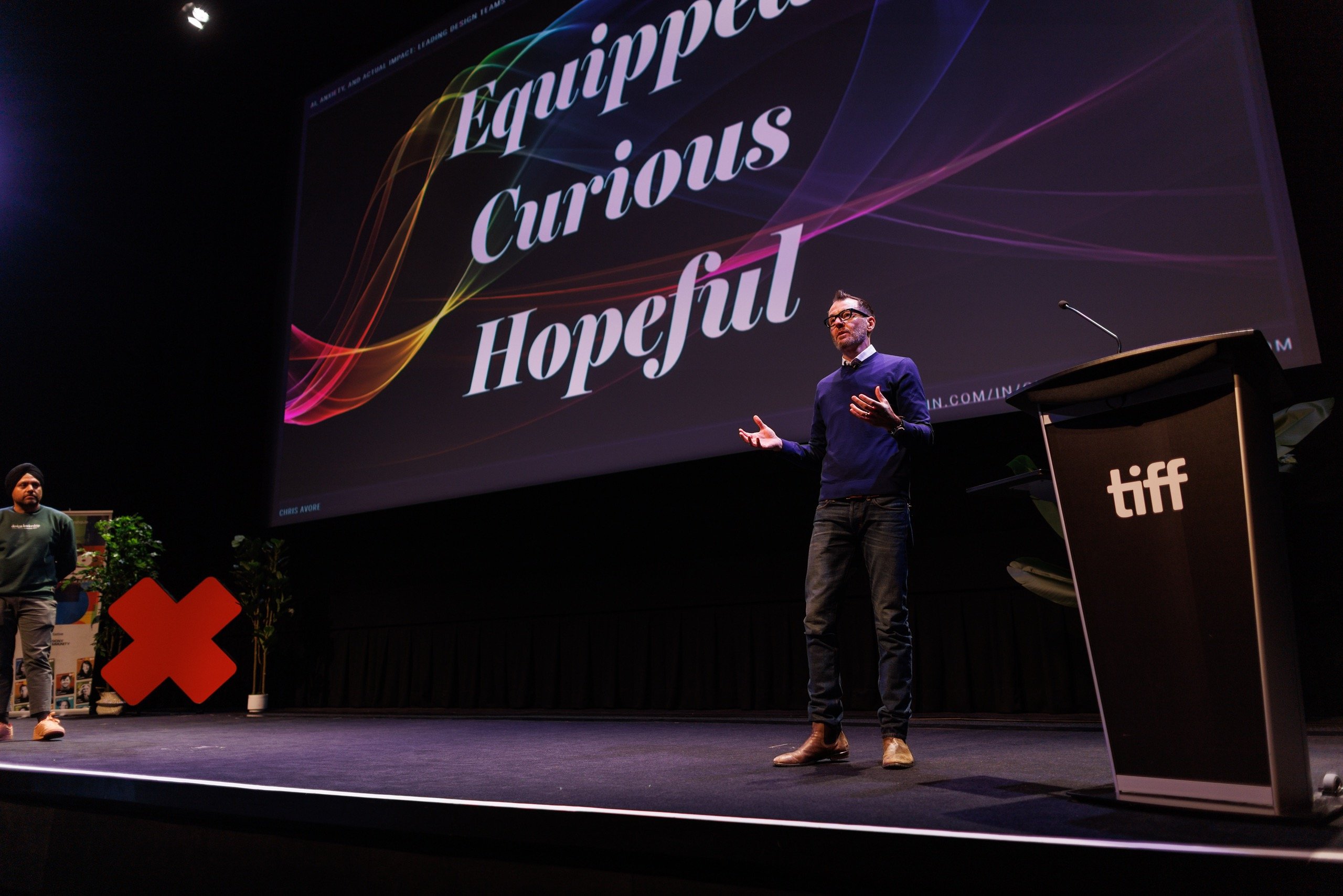
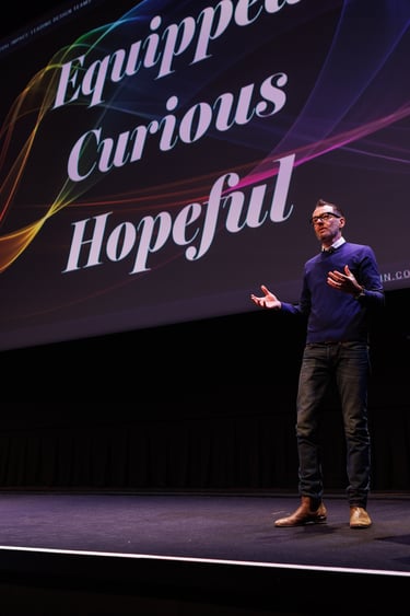
I’ve spoken at design conferences across North America, South America, Europe, and Australia on topics ranging from scaling design teams to integrating AI into product development. My talks focus on the intersection of leadership, systems thinking, and emerging technology — offering frameworks, not just inspiration, to help teams lead the future of design.
Curious if I’m the right speaker for your event? Check out recent talks and popular topics here.